Note: Due to NDA restrictions, visuals of the flow and prototype are blurred. Full details can be shown privately during interviews.
UX designer
6 Months
1 UX Designer
1 UI Designer
Figma
Confluence
2024
100%
Design an intuitive, multi-screen dashboard for the new Royal Enfield motorcycle. I had to upgrade a simple, single-screen system to a complex three-screen layout while ensuring rider safety and maximum clarity.
Note: Due to NDA restrictions, visuals of the flow and prototype are blurred. Full details can be shown privately during interviews.
To ensure a smooth transition from the previous single-screen model, a key focus was keeping the core interactions familiar.


As someone who had never driven a motorcycle, I dedicated the first month to intensive self-study. I quickly learned the motorcycle software design manual and industry safety regulations to build a strong foundation.
I led the UX interaction design (100% participation), translating client vision into wireframes and user flows. My core focus was creating safe, intuitive interactions using only a limited 5-direction handlebar joystick.
I was restricted to working under strict Figma constraints (e.g., prohibition of using boolean operations) because the development company had limitations on their side.
We managed a highly demanding client who frequently changed requirements mid-project. To keep pace, I proactively implemented automatic note-taking tools during meetings.
The project required adapting to a demanding India time zone while working from Germany.

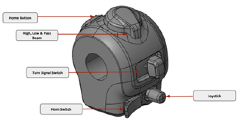
| A major challenge was the joystick's limited range of motion and the client's frequent shifts on content placement (left vs. right screen). This required highly iterative wireframing to ensure that, despite the constraints, the final flows were non-distracting and intuitive for a rider at high speed. |

| We used agile methods (Scrum) to rapidly develop five mid-fidelity prototypes (MVP). The final designs, which included a "virtual joystick" visual cue, were successfully showcased and tested with real riders to validate the usability of the new three-screen system. |