Role

UX designer

Duration

1 week

Team

1 UX Designer


Tools

Figma

Year

2021

Participation

100%

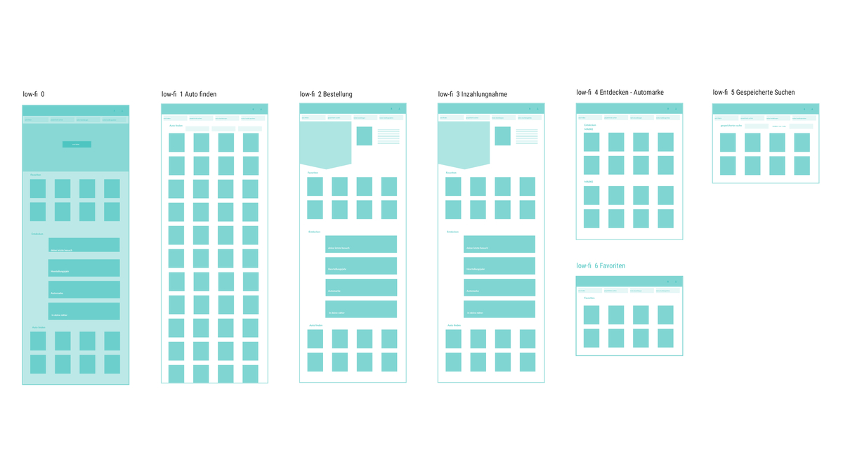
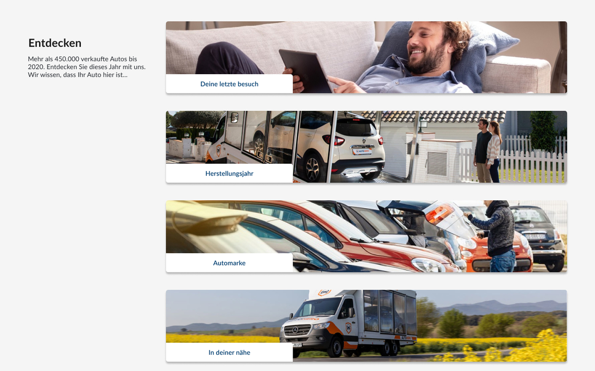
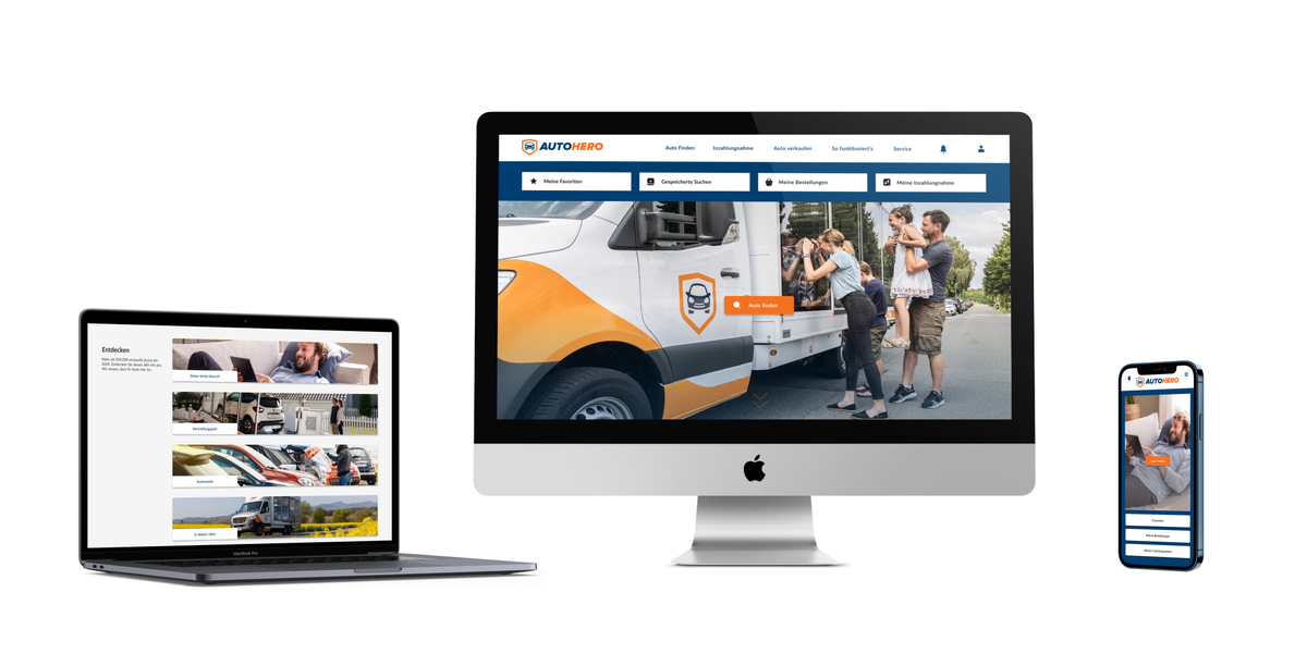
"Users needed a more engaging, easier navigation experience that reflected the emotional significance of purchasing a car"


Ale Pia

(Stakeholder)

This was a redesign project for the user page of Auto1’s car-selling platform. The goal was to improve usability, visual hierarchy, and user engagement by rethinking the layout and adding new features.

Mood Board & Color Choices

I ran a mood board survey asking users to associate words with car buying. Most answers pointed to trust, confidence, and friendliness. Based on this, I chose a blue-orange palette to evoke trust and highlight CTAs.

“The orange accents really caught my attention, they made the buttons stand out without feeling aggressive. It felt more energetic and confident compared to plain blue.”


Carlos M., occasional car seller, 38

Using Jakob Nielsen’s principles, I found key usability issues: lack of visual hierarchy, cluttered dropdowns, poor use of white space, and overwhelming content. I mapped these issues before redesigning the layout.

UI Redesign & Wireframes

I created high-fidelity wireframes focusing on simplicity and clarity. I improved navigation, spacing, and button clarity. I also proposed a new “favorite” system with better visual cues and cleaner structure.

Next Steps (Future Vision)

Ideas for future iterations include:


  • Launching a beta version for testing


  • Adding smart filters (e.g., seasonal cars)


  • Creating a swipe-to-like feature (“Auto Tinder”)


  • Running more user tests
​​​

ALL PROJECTS