UX/UI designer
1 Week
not applicable
Figma
Screen Design (hi-fi)
not applicable
Initially, navigating the Temple of Cards website proved challenging. It mimics the mental models of other e-commerce platforms like Amazon, with a significant header space, a footer at the bottom, and product details organised on the left. Despite these familiar structures, the site suffers from cluttered elements with insufficient spacing, losing visual hierarchy.
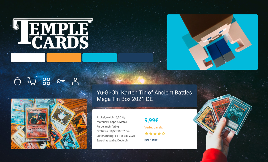
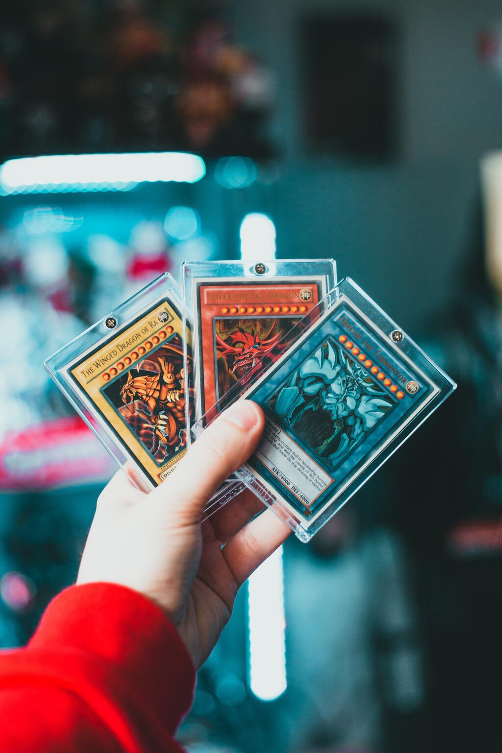
When I received the assignment to redesign the Temple of Cards website, I was thrilled due to my personal enthusiasm for games. While I am familiar with PC game categories, the card games sold at Temple of Cards were new to me. These games' vibrant colours and expressive graphics immediately caught my eye, drawing me into their world.
The key issues identified included an overwhelming header with misplaced contact information, a distracting background considered outdated in modern web design, and a general lack of structured information architecture. Navigation was confusing, icons and buttons were improperly sized, and essential product features were buried under less critical information.
Feedback from testing would guide further refinements:
- Implementing a card-sorting exercise to optimise menu taxonomy and ensure categories are user-friendly.
- Conducting surveys or interviews to pinpoint critical product information desired by users, which would then streamline the product descriptions on the site.
To address these issues, I proposed several changes:
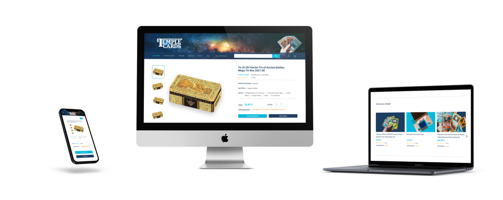
- Redesigning the layout using a 12-column grid with 60-pixel margins to enhance structure.
- Simplify the "Artikel details" submenu and ensure that critical product features like 'Merkmale' are prominently displayed.
- Reorganizing the footer to eliminate unnecessary elements and streamline content.
Based on the ideation phase, mood boards incorporating the brand attributes—Modern, Youthful, Futuristic—were created. These served as a preliminary visual guide to re-envisioning the website, ensuring the design aligns with user expectations and brand identity.
Assuming the stakeholder agrees to user-focused research, we would conduct surveys on the redesigned elements, including colour palette, typography, and iconography. With a hypothetical response rate of 70% approval from 100 users, we would confirm that our design resonates with the target audience, validating our user-centred approach.
This systematic redesign aims to significantly boost conversion rates by making the site more user-centred and visually coherent.